Design File to Design System: A practical guide
Introduction
Type “design system” into Medium and what do you get? “X,Y,Z the design system, setting up a design system, our design system…” Most of these offer little to no help when it comes to putting an existing project into a design system, or even offer the insight behind how you would tackle such a task.
Unable to find the necessary research or past experiences other agencies have had made this become something of irritation at Inktrap. Free design systems are great if you’re starting a project from the ground up but for most this isn’t the case, the need for a design system usually arises after the project has grown, evolved and isn’t losing momentum. A design system is an organic thing that grows and develops over time, which makes starting one so much harder.
Isn't it just a Figma file with reusable components? No?
In this article, we will go through why the need for a design system arises, planning and creating the design system, and then combining the project and design system.
Why create a design system?
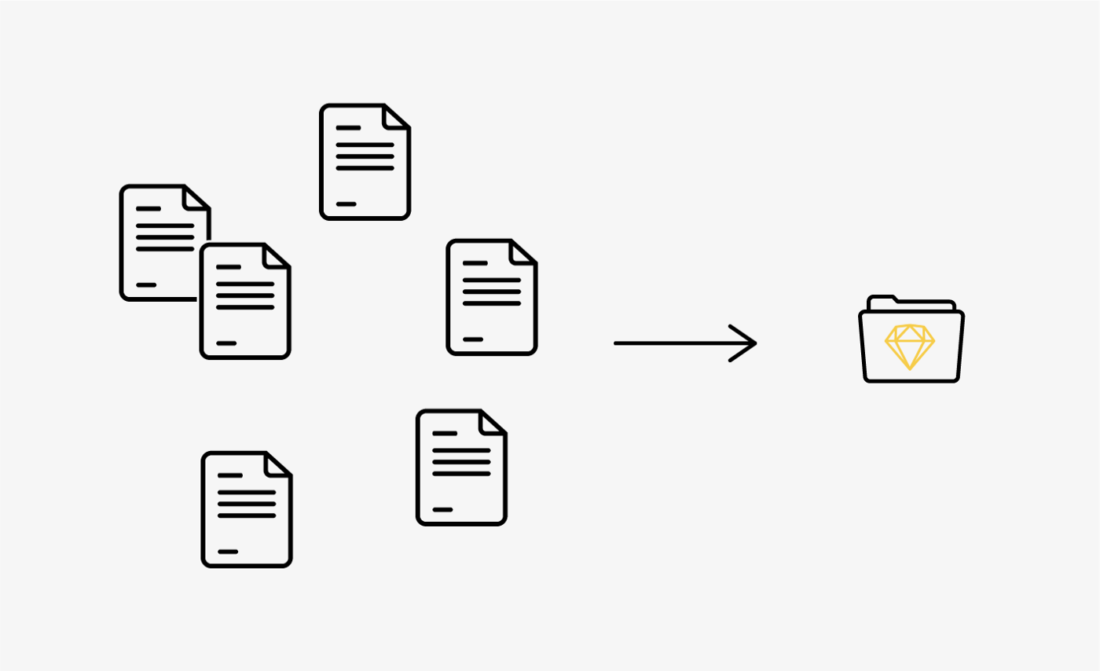
Now, where do I start… in the beginning, there was a project. Let’s call it Project X. Project X is a start-up that had to move quickly, it’s currently made up of a digital product and a marketing site. This has resulted in three separate Sketch files; one for the marketing site, the product and one that is the first attempt at a design system for this project.
As this project has been going on for as long as Sketch has existed, it has been worked on by multiple designers and gone through many iterations. This combined with the fact that it had to be done at speed has created a disjointed, unorganised and inconsistent project*, these are just a few of the words used to describe what you see when looking through the files. Working this way has been fine up until this point but as the team grows and the number of brand touchpoints increases an efficient way to deliver consistency is required.
That’s not to take anything from the design itself — most of these variations never made it to the front-end. Regardless, this just made it harder to maintain the current level of design and keep elements uniform across products, now that the developers have started creating a library of reusable components and assets to easily build and implement future features a design system is needed to tie everything together.
In this article, we’ll run through some tips and tricks for converting a patchwork quilt of designs into a uniformed, compact design system ready to make future feature implementation a walk in the park.
*I have made Project X seem more problematic than it is — artistic license helping to illustrate the point of our need for a design system.
Research and findings
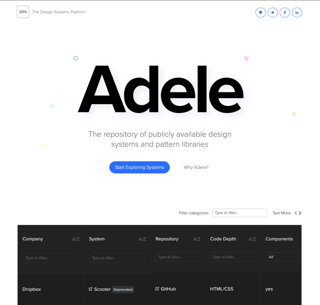
One of the first steps we take towards creating a design system is research; the different types of systems, what system works best, just to keep up-to-date with the latest best practice. We have several websites on standby that provide us with insights that help to shape the system we create:


Atomic Design
One thing to notice is that there are thousands of design systems, so how can you choose which one is right for you? Are any of them right for you? The most prevalent design system foundation to date is Atomic Design.
Atomic Design is the most talked-about way of organising a design system at the moment, it is used by many companies as a ready-made framework and also used as a foundation for creating a bespoke solution.
If you don’t know what Atomic Design is, a brief explanation would be that it is a way of categorising elements in your system based on complexity. These 5 categories are Atoms, Molecules, Organisms, Templates and Pages.
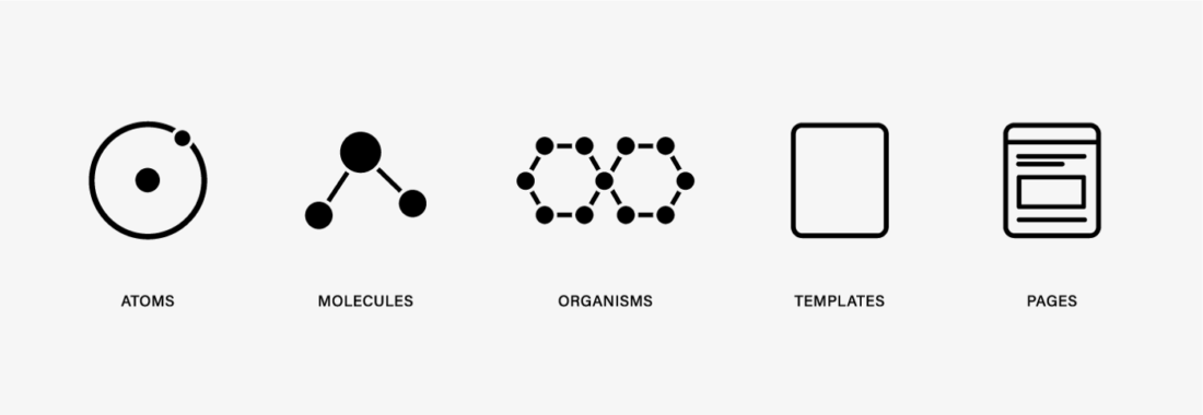
Atoms: These are the building blocks — Labels, Inputs, Buttons.
Molecules: These are groups of Atoms — Input + Button = Inline Form.
Organisms: A combination of Molecules to form a section.
Templates: Multiple Organisms coming together to create a template.
Page: A more direct and padded out version of the templates.
We use Atomic Design as a basis for our design systems, we don’t use it directly but as a starting point. We came to the conclusion that it didn’t seem right for what we wanted (the terminology and categorisation). Whilst doing the first round of research we found that someone else was having the same thoughts as us and that helped to validate our feelings.
Everyone has a way of working and you can see this reflected in all design systems. Unfortunately, there is no ‘one size fits all’ when it comes to design systems, you can’t download one and ta-da! You’re now the expert, it’s the equivalent of going suit shopping and picking the suit that was tailored for someone else, yes, you might be able to fit in but you could have had one made for your size and your needs.
Understanding how the entire process works from the ground up is a much better way of doing things. It means you know the reason behind all the nuances in the system because you created them! Having that knowledge is going to be key to creating a design system that works for you and your team.
Plan of action
After we have gone through our findings from the research phase, it’s time to put a plan of action together. Having access to a fantastic design team has its benefits and one of those is that we can collaborate and bounce ideas off each other rapidly.
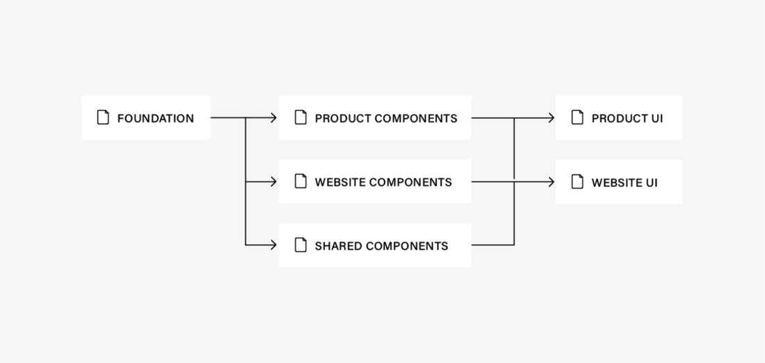
Once we have an idea of a direction we can start the process of converting the design files into a design system, before we get to that let's talk about our design system. This is the structure we use to create a uniform, controlled and scalable system.
This is what it looks like when you create a new project folder:
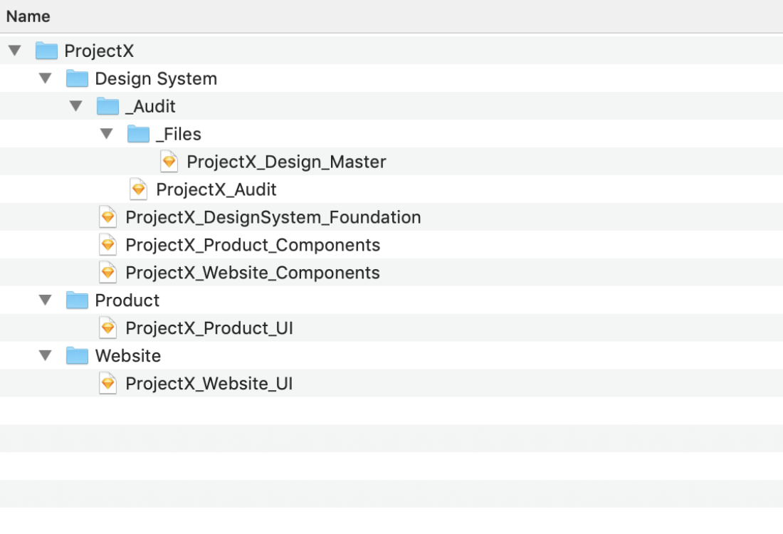
Structuring the design system
It can be hard to understand from just the folder structure alone so I will add some context.
_Files/
Where the duplicated original design files are held for safekeeping.
_Audit/
All the symbols from the files in the _Files folder eventually get added here to be merged, sorted, renamed. (If you are sharing the workload then each person should take a product/website and add it into an audit file, taking note of duplicates and inconsistencies) and eventually, they will get merged into one.
Design System/
This is where all our symbol libraries are held. The files are split into Foundation (Buttons, Colours, Input Fields), Components (Cards, Sections), Shared Components (Navigation, Sections, Footer)
Product/Website
This is where all our UI files go, this folder is duplicated per Product/Website.
Hopefully, that helps to clear up the folder structure. As you can see this bears a few similarities to the Atomic Design system that we mentioned before, but with our own added spin to make it easier for us and you to understand.
Creating the design system
So now you have an understanding of the design system we have created, it’s time to learn more about our process for converting your designs into a system.
Note: This will be a basic overview of the steps and process, touching on just a few of the steps to give you an understanding of our thinking.
Step 1: The cleanup
The first step is to remove any junk from the files, any old symbols you’re not using, any unused concepts or scrapped designs.
To do this we:
- Delete any concepts/scrap artboards
- Use the Symbol Organiser plugin to delete unused symbols
- Run the Cleanup useless groups to remove redundant folders
Step 2: Split and merge
Now the files are starting to look slightly better, the next step is to split up the symbols into the correct design system files.
To do this we:
- Copy the symbols to the correct files (Foundation, Components, etc…)
- Run the Merge Duplicates Symbols plugin in the files
Step 3: The link-up
This is the part where we link the UI with the symbols and make sure everything is connected together.
To do this we:
- Create blank UI folders and files for all of the products/websites
- Go into the UI files and run the Library Symbol Replacer plugin, this ensured that all our symbols in the UI files are linked to both the foundation and component files
Now that all the UI elements are connected to their respected symbol any changes we made in the components/foundation files are reflected across all designs.
Step 4: Rename and combine
Now it is time to start renaming and combining symbols (we can only do this once the symbols are linked otherwise it means a lot of replacing elements in the UI files)
Combining is different from merging. Merging is merging duplicates together whereas combining is giving one symbol the flexibility previously provided by two.
To do this we:
- Rename symbols appropriately, making them conform to the same naming convention, using the RenameIt plugin can help speed things up when you need to batch rename things
- Symbol instance renamer is great as it renames all the symbols in the UI to match what the symbol is now named
- Combine any necessary symbols
- Run the Symbol Organiser plugin to organise artboards
Step 5: The Check
Once we are satisfied that everything is linked together and named correctly the first thing we do is share it with the wider team. Get someone who hasn’t worked on the project before and has fresh eyes to see if they can spot anything that may have been missed.
After this, we then go through the UI files with a fine-toothed comb comparing it to the original UI files to make sure that everything has stayed the same and the design hasn't changed, if it has then we change it to match the original*.
*Doing this can sometimes reset symbol overrides meaning you will have to go back and change the designs to match how they were.
The benefits of a design system
So… is it worth all those hours of work? The answer is yes! Creating a design system is not an easy choice for a company. At face value, it can be perceived as sacrificing a lot of time and energy just for some simple organisation… but it’s so much more than that.
The benefits of the design system will be most noticeable 2–3 months down the line when you are able to rapidly create, build and test new features in a fraction of the time it used to. As multiple people join and work on the project you can keep the high level of design consistent because of the uniformed names and componentised elements, plus have the ability to scale your product without having to worry about it breaking or not fitting in with your other designs.
These are the main benefits, the others we’ll reserve for a future article.
Next steps
So now we have the system it’s time to test, make changes and iterate on the system based on feedback from other designers and developers using it both internally and externally.
Another step worth taking is to use the structure from our design system and replicate that in Storybook so both the designers and developers are on the same page when it comes to talking about elements of the product.
Summary
Creating a design system for an existing product with messy design files requires time and effort. Research design systems but more than likely you will have to create your own as one size does not fit all. Creating a design system isn’t easy and will require several steps to get it done. Overall it’s worth the time and effort and will make your life easier in the long run.
Let's get started

Chat with James
Book a free discovery call with our co-founder to see if we’re a good match for your requirements.
